UPSC CSE Prelims 2011
The following pie charts show the breakup of disease categories recorded in the patients from two towns, Town A and Town B. Pie charts plot the disease categories as percentage of the total number of patients. Based on these, answer the question that follows.
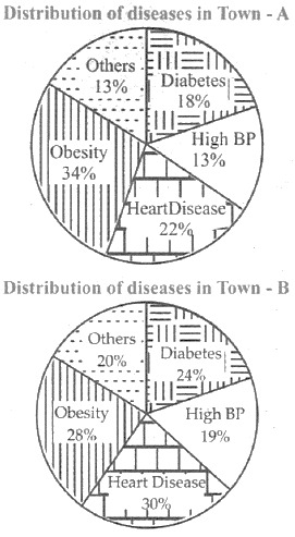
What can we say about persons with more than one disease from these graphs?
EXPLANATION
Correct Option (2)
The pie chart for Town B indicates that the sum of percentages for all disease categories is 121%. When the total percentage of disease categories exceeds 100% of the patient population, it implies that some individuals are classified under more than one disease category. This suggests the presence of patients suffering from multiple diseases within Town B.
Incorrect Options:
The pie chart for Town A, when summed, totals 100% of the patient population. This distribution does not inherently suggest that individuals have more than one disease, as each patient could be exclusively assigned to a single disease category. Therefore, options stating the likelihood of persons with more than one disease in Town A (Option 1) or in both Towns A and B (Option 3) are not supported by the data.
An inference can be drawn regarding Town B based on the sum of its disease percentages. Consequently, the statement that no inference can be drawn (Option 4) is incorrect.